2025-04-09 Visualizing pages and shifts
This release brings new visualization tools to help you track and respond to problems more effectively. Check out the page timeline to see the full life cycle of any page and use the team dashboard's new shift transition visual to make handoffs clearer than ever. Moments also got a major UX revamp too - grab a coffee and enjoy the refreshed experience!
☎️ Page timeline
Getting paged is about action. Handling a page or escalating it to a teammate is all in a day's work. When the dust settles — or when you're in the thick of it — a clear timeline of events is essential for understanding what happened and how it was resolved. Say hello to Hotpot's page timeline:
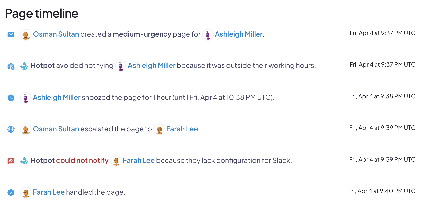
The timeline helps you see the details of escalations, failed communication attempts, and resolutions all in a single view.
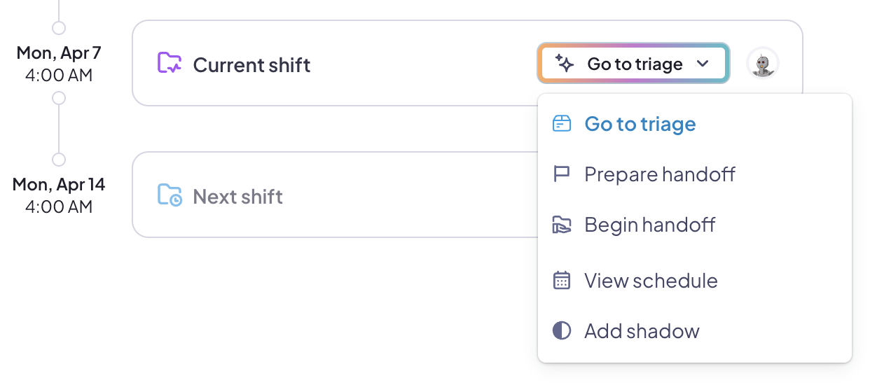
⏳ Team shift transition visual
Responsibility for handoff changes like clockwork, but handoffs happen at times that are socially convenient for the team. To make this clearer, Hotpot's new shift transition view shows the last, current, and previous shifts for each team:
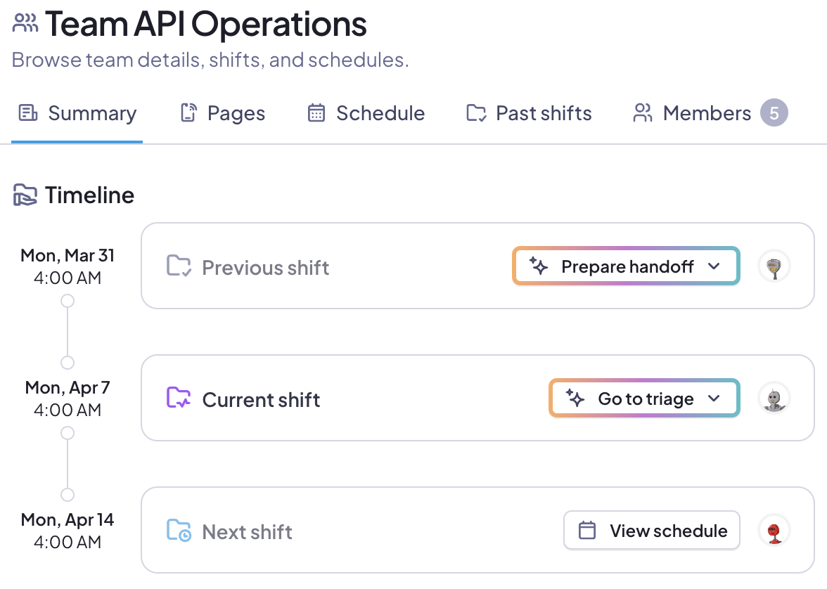
The convenient buttons not only help convey status, they also enable quick actions for the current shift:
Moment UX improvements
Our moment views have been updated with the same UX improvements as our paging UI. Views are now more responsive, give more space, and are consistent across Hotpot.
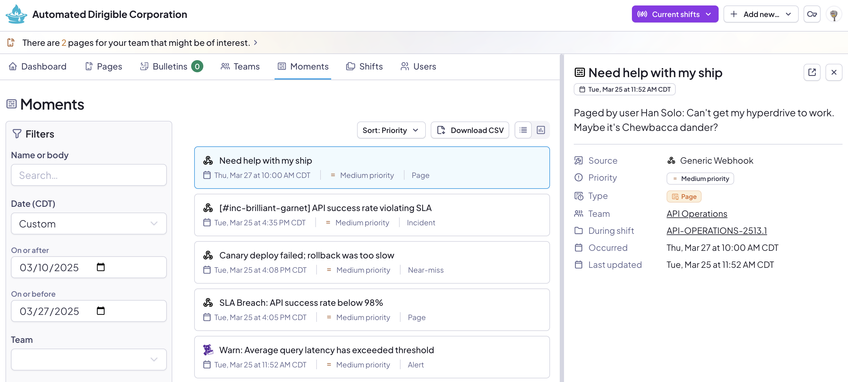
Eagle-eyed readers will note the new Download CSV button for turning searches into CSV files.
That's not all. There's so much, we've got a bulleted list!
- Sorting results now retains search parameters.
- Sort button has been moved for space.
- Pagination has been adjusted to show the total number of records as well as the offsets on the current page.
- Group badges are now links where shown.
💼 Other changes
- Grammar: Some fixes.
- Schedule: Touch events have been improved when interacting with the schedule visualization.
- Schedule: Users in each stage are now alphabetically sorted when viewing a schedule.
- Shift: Social status, team, and schedule selection inputs are now ordered in a more predictable way.
- UI: Component used for entity selection (search filters, people to page, etc) has been improved, especially on mobile.
- UI: Many form styles have been invisibly overhauled in a way that makes our lives much easier.
- UI: Many icons have been refreshed as we consolidate on a single style of icons.
- UI: Improved in-page anchor navigation.